Join for FREE | Take the Tour Lost Password?
[x]

deviantART

 
©2006-2009 ~readme-txt
:iconreadme-txt:

Artist's Comments

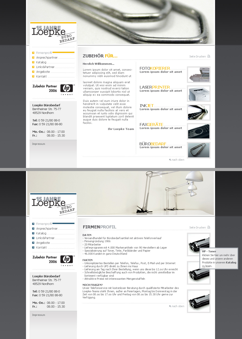
A small layout ... they didnt want too much eye candy so I tried to keep it simple

Edit: They wanted to see da slightly differen color-scheme ... so I did a yellow/gray based subpage.

Comments


love 0 0 joy 0 0 wow 0 0 mad 0 0 sad 0 0 fear 0 0 neutral 0 0
:iconndroid:
nice work, i like the colors. :)
:iconmiksago:
looks awesome good use of the K.I.S.S rule...

--
Freelance Web Developer | BrandedCode
:iconkillaart:
nice and smooooooth :D as i said

--
luv to see ya smile
:iconbz:
nice work

--
:thumb37732020: :thumb21123457: :thumb30359957: :thumb32849092:
:icono-pie:
i like this

--
TA - [link]
:iconsunsunich:
yeah, simplicity isn't bad. i'd say simplicity in design 'ist ziemlich gut'. :)
i find it funny you have the 'nach oben' link on such a short page... tempalting isn't good, mr. ;)
the horisontal blue line next to the 'firmenprofil' in menu is no good. looks odd to me.

not a bad photo in the top are. i'd set all the lights in equal position. they look too disharmonic this way. disorder doesn't suite here imho.

left bottom greyness (under the 'fr. 08.00...') is odd. :(

generally, i enjoyed the design. cheers.
:iconreadme-txt:
Thanks for all the comments :) ... I appreciate them and take the critic into account for the second draft (no response from the customer yet though)

--
Web Designers' Couch :couch:
:iconskyfyre:
simple and clean... i like it :)
:iconsoully:
very clean, i like it

--
:couch:

Details

July 28, 2006
317 KB
1024×1435

Statistics

10
8 [who?]
1,191 (0 today)

Site Map